旋转效果
效果

代码
html
<div class="box">
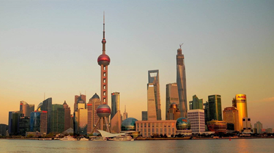
<img src="./shanghai.jpg" alt="上海">
<div class="mask">上海</div>
</div>css
.box {
    width: 400px;
    height: 224px;
    position: relative;
    overflow: hidden;
}

.box img {
    transition: all 0.5s linear;
}

.box:hover img {
    transform: scale(2) rotate(30deg);
}

.mask {
    position: absolute;
    width: 400px;
    height: 224px;
    color: #fff;
    left: 0;
    top: 0;
    text-align: center;
    line-height: 224px;
    font-size: 100px;
    background-color: black;
    opacity: 0;
    transition: all 1s linear;
    cursor: pointer;
}

.mask:hover {
    opacity: 0.5;
}