天气预报
效果
代码
html
<section>
<ul class="slider">
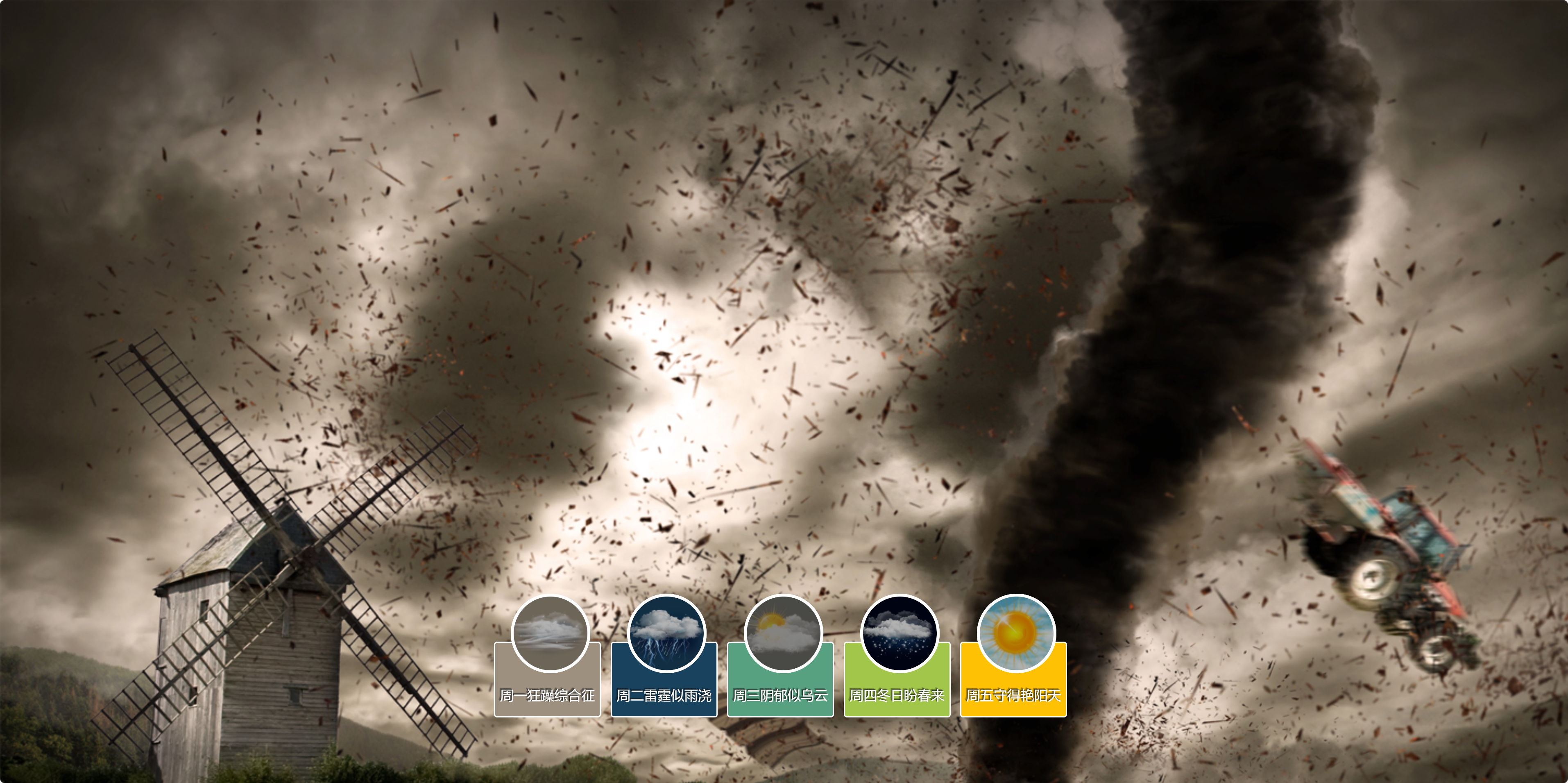
<li><a href="#bg1">周一狂躁综合征</a></li>
<li><a href="#bg2">周二雷霆似雨浇</a></li>
<li><a href="#bg3">周三阴郁似乌云</a></li>
<li><a href="#bg4">周四冬日盼春来</a></li>
<li><a href="#bg5">周五守得艳阳天</a></li>
</ul>
<img id="bg1" class="bg slideLeft" src="img/bg1.jpg" alt="">
<img id="bg2" class="bg slideBottom" src="img/bg2.jpg" alt="">
<img id="bg3" class="bg zoomIn" src="img/bg3.jpg" alt="">
<img id="bg4" class="bg zoomOut" src="img/bg4.jpg" alt="">
<img id="bg5" class="bg zoomrotate" src="img/bg5.jpg" alt="">
</section>css
/* 重置样式 */
body,
ul,
li,
p,
h1,
h2,
h3,
img {
  margin: 0;
  padding: 0;
  border: 0;
  list-style: none;
}

body {
  font-family: "微软雅黑";
}

a:link,
a:visited {
  text-decoration: none;
}

img.bg {
  width: 100%;
  height: auto;
  min-width: 1024px;
  position: fixed;
  z-index: 1;
}

.slider {
  position: absolute;
  bottom: 100px;
  width: 100%;
  text-align: center;
  z-index: 9999;
}

.slider li {
  display: inline-block;
  width: 170px;
  height: 130px;
  margin-right: 15px;
}

.slider a {
  width: 170px;
  font-size: 22px;
  color: #fff;
  display: inline-block;
  padding-top: 70px;
  padding-bottom: 20px;
  border: 2px solid #fff;
  border-radius: 5px;
  position: relative;
  cursor: pointer;
  text-shadow: -1px -1px 1px rgba(0, 0, 0, 0.8),
    -2px -2px 1px rgba(0, 0, 0, 0.3), -3px -3px 1px rgba(0, 0, 0, 0.3);
}

.slider li:nth-of-type(1) a {
  background-color: #9d907f;
}

.slider li:nth-of-type(2) a {
  background-color: #19425e;
}

.slider li:nth-of-type(3) a {
  background-color: #58a180;
}

.slider li:nth-of-type(4) a {
  background-color: #a1c64a;
}

.slider li:nth-of-type(5) a {
  background-color: #ffc103;
}

.slider a::after {
  content: "";
  display: block;
  height: 120px;
  width: 120px;
  border: 5px solid #fff;
  border-radius: 50%;
  position: absolute;
  left: 50%;
  top: -80px;
  z-index: 9998;
  margin-left: -60px;
}

.slider li:nth-of-type(1) a::after {
  background: url(img/sbg1.jpg) no-repeat center;
}

.slider li:nth-of-type(2) a::after {
  background: url(img/sbg2.jpg) no-repeat center;
}

.slider li:nth-of-type(3) a::after {
  background: url(img/sbg3.jpg) no-repeat center;
}

.slider li:nth-of-type(4) a::after {
  background: url(img/sbg4.jpg) no-repeat center;
}

.slider li:nth-of-type(5) a::after {
  background: url(img/sbg5.jpg) no-repeat center;
}

.slider a::before {
  content: " ";
  display: block;
  width: 120px;
  height: 120px;
  border: 5px solid #fff;
  border-radius: 50%;
  position: absolute;
  left: 50%;
  top: -80px;
  margin-left: -60px;
  z-index: 9999;
  background: rgba(0, 0, 0, 0.3);
}

.slider a:hover::before {
  opacity: 0;
}

/* 侧滑效果 */
@keyframes slideLeft {
  0% {
    left: -500px;
  }

  100% {
    left: 0;
  }
}

.slideLeft:target {
  z-index: 100;
  animation: slideLeft 1s 1;
}

/* 上滑效果 */
@keyframes slideBottom {
  0% {
    top: 350px;
  }

  100% {
    top: 0;
  }
}

.slideBottom:target {
  z-index: 100;
  animation: slideBottom 1s 1;
}

/* 放大效果 */
@keyframes zoomIn {
  0% {
    transform: scale(0.1);
  }

  100% {
    transform: none;
  }
}

.bg.zoomIn:target {
  z-index: 100;
  animation: zoomIn 1s 1 forwards;
}

/* 缩小效果 */
@keyframes zoomOut {
  0% {
    transform: scale(2);
  }

  100% {
    transform: none;
  }
}

.zoomOut:target {
  z-index: 100;
  animation: zoomOut 1s 1 forwards;
}

/* 旋转放大效果 */
@keyframes zoomrotate {
  0% {
    transform: rotate(-360deg) scale(0.1);
  }

  100% {
    transform: none;
  }
}

.zoomrotate:target {
  z-index: 100;
  animation: zoomrotate 1s 1 forwards;
}

@keyframes notTarget {
  0% {
    z-index: 75;
  }

  100% {
    z-index: 75;
  }
}

.bg:not(:target) {
  animation: notTarget 1s 1;
}